MVO Nederland
Visual identity
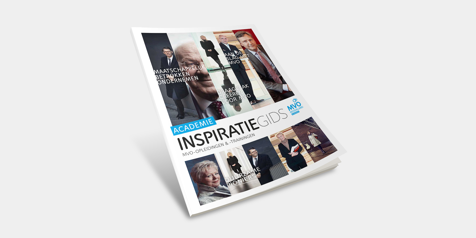
MVO Nederland is the independent Dutch knowledge centre and network organisation for corporate social responsibility. Mattmo created a new visual identity.
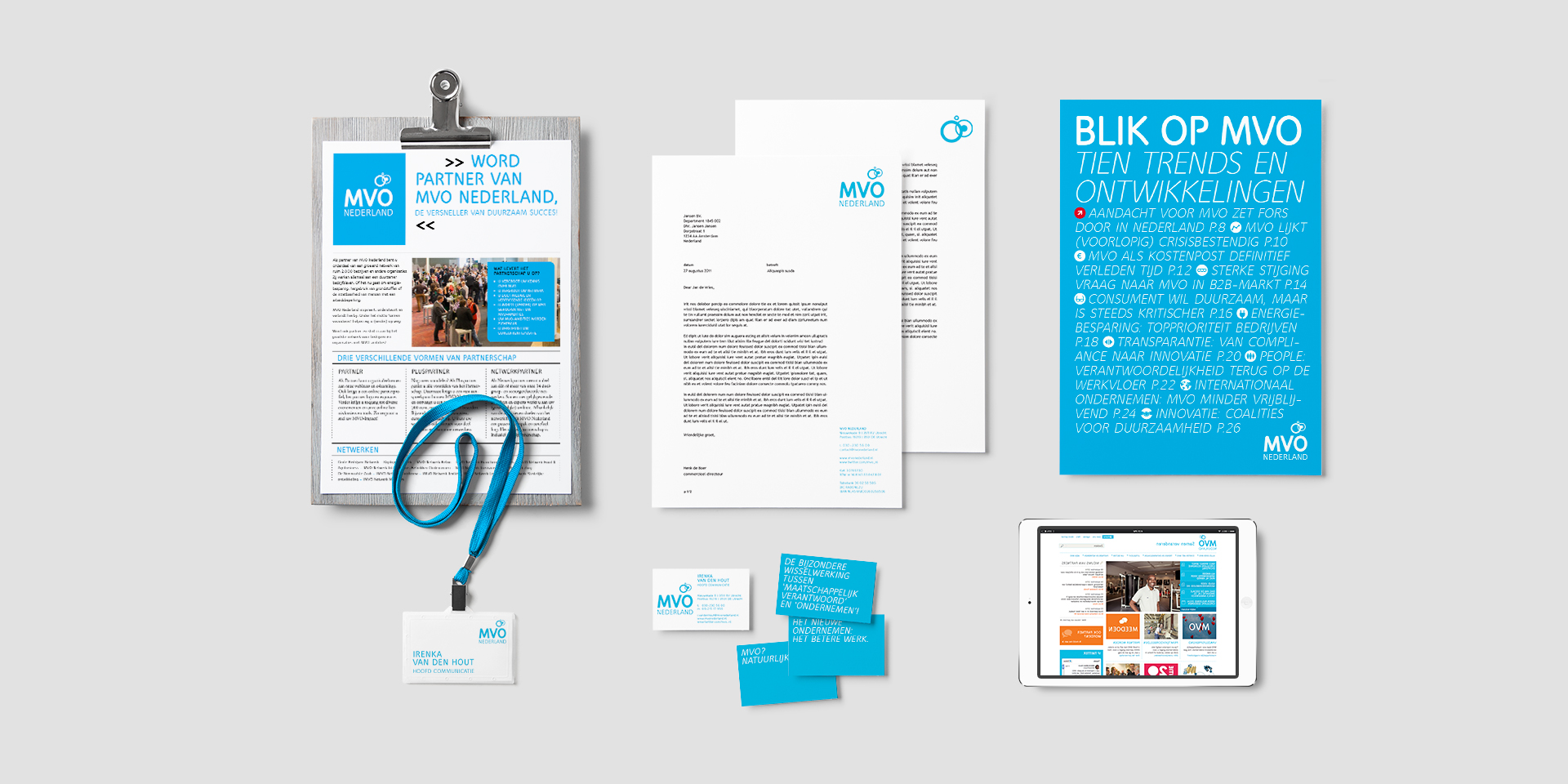

Mattmo intentionally redesigned MVO Nederland’s identity and chose blue for their logo.
The choice for the colour blue was to signify a new focus. Initially CSR meant doing business in a green way with a focus on sustainability. Now CSR includes social aspects and operating transparently across the board focusing on people. In the new visual identity the more corporate colour of blue reflects this. The matching logo also symbolises the network of CR conscious companies and organisations that MVO Nederland stands for.
Irenka van den Hout, MVO Nederland’s Head of Communications, is very pleased with Mattmo’s design: “The new design underlines the openness of our organisation.
The logo reflects the sustainable connection we build up with an ever-growing group of entrepreneurs in implementing Corporate Social Responsibility. I also see the diversity of our network in the logo; our partners range from multinationals to freelancers.
The new design underlines the openness of our organisation.
Irenka van den Hout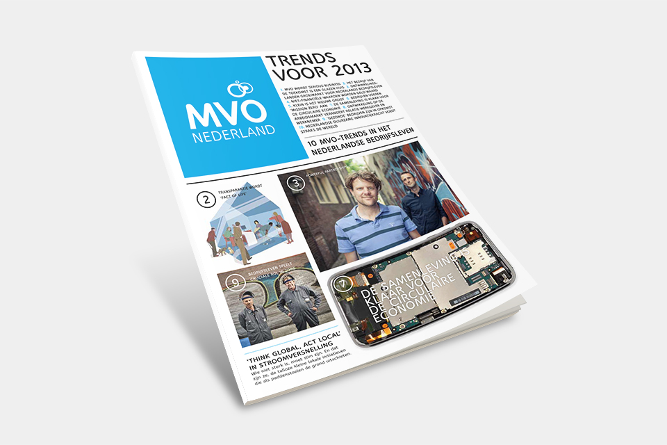


LET'S MEET
And talk about your product or brand